

CLAY GROUND
TIME TO CLAY
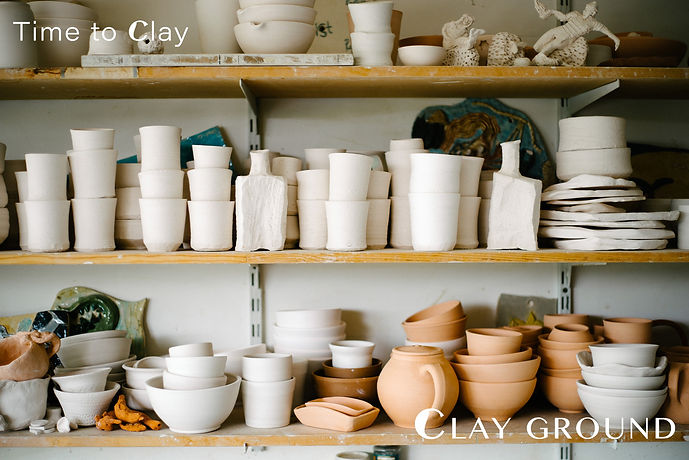
Pottery Studio Brand Design
如何从触感开始设计?
How does design begin with touch?
ClayGround 是一个关于“手”与“泥土”、关于“游戏”与“生活质地”的游乐场。我为此项目策划品牌命名、Slogan,并构建完整的品牌视觉系统,贯穿 LOGO、图形、色谱、语义、周边与物料的应用逻辑。
品牌名 “ClayGround” 既由 clay(土)与 ground(土地、基础)组成,也有意化用了“playground”(游乐场)之意,赋予陶艺以一种不带功能目的的松弛精神——它既是制作现场,也是触感的游乐场,是一种建立节奏的方式。中文名 “可粒陶艺” 是我对英文发音的音译再造,保留了 clay 的发音质地,同时引入“可”“粒”两字的颗粒感与亲近感,让语言本身也具有泥土的触觉属性。Slogan “Time To Clay” 是一句轻盈却耐嚼的语言游戏。它既意味着“轮到你动手”,也像是一句提醒:“是时候 clay 一下了。” 在这个句式中,“clay” 被动词化,它不再只是材料,而成为一种行动:揉捏、停留、生成、构建。
ClayGround is a playground for hands and soil — for play, touch, and the texture of everyday life. I led the naming, slogan creation, and full visual identity for the brand, spanning logo, graphics, color palette, tone, and material applications.
The name combines “clay” and “ground” — material and foundation — while subtly echoing “playground,” lending the brand a sense of unhurried play. It’s a place of making, but also of rhythm and return. The Chinese name “可粒陶艺” (Kěli Táoyì) is a phonetic echo of “clay,” with characters that suggest grain, tactility, and closeness — language shaped like clay itself. The slogan “Time To Clay” is a light yet chewy turn of phrase. It signals, “It’s your turn,” and at the same time suggests, “It’s time to clay.” In this line, “clay” becomes a verb — no longer merely a substance, but an act: to knead, to pause, to shape, to build.

图形如何承载内在的生长逻辑?
How can form express inner growth?
LOGO 设计以大写字母 C 为基础,负形空间构成瓶状器皿,一枝带叶花枝自内插入,弯折处自然形成小写字母 g。图形在视觉上形成 clay 与 ground 的首字母连结,也隐含“花自泥中来”的生长逻辑。LOGO 整体以柔和曲线描摹,带有弧度与回旋,配合字组 CLAY GROUND 形成稳定三角结构,暗示出一种内聚、不迎合、自持、却持续向上的节奏 —— 如同该品牌女性创始人自身的状态,一种不急于言说、却持续生长的张力。
The logo centers on an uppercase C, whose negative space forms a vase. A flower stem bends within it to form a lowercase g, linking the initials of the brand while hinting at slow, rooted growth. Soft curves meet subtle lift, forming a stable triangle with the logotype — suggesting quiet resolve and steady momentum, much like the founder’s own pace: calm, grounded, yet always growing.


“慢”如何构成形状?
What shape can slowness take?
整个视觉语言围绕“温柔的结构感”展开,在克制中保留松动的余地,如同陶土的气孔一般,供品牌自身呼吸,也给使用者留下解读的可能。ClayGround 是一个器物慢慢变形、理念慢慢显形的过程。它以 clay 为材料,也以 play 为方法。而我所做的,是为这个过程提供一个视觉可以安放、语言可以生根的场。
The visual language centers on a gentle sense of structure — spacious, tactile, and composed, like the porous surface of clay that lets objects breathe and meanings emerge. ClayGround is where form takes time to appear. Clay is the material, play is the method. My role was to give this process a place — for vision to settle, and language to take root.


Client: CLAY GROUND
Design / Copywriting: Boren @BOREN Studio
2025, Wenzhou, China